Tuesday, 30 January 2018

,
I decided to do some research into the layout of CD Album front cover design. I thought this would be relevant because some artists sell their music based either on their name, because it is more recognisable, or the title of the album.  I wanted to look at a variety of artists who produce different types of music. Looking at the bands and artist, Justin Timberlake, Eminem and The Script I saw a range of designs that are set up completely differently from one another. Justin Timberlake's front cover heavily release on the min image, he uses this to structure his front cover and uses his initials 'J' and 'T' for his name and the release date as the subheading. The title of the album is written in the smallest font.

Similar to the previous front cover, Eminem positioned his name in bold, capitalised font, centralised in the centre of the front cover. Although the name of the album is positioned directly under the artist name, the visual point in this front cover is the name of the artist. The black font contrasts with the lighter background, foregrounding the name of the artist.
The front cover designed for the band 'The Script' for the album titled 'science & faith' has a main image that becomes the visual point in the album. The main image of the hands and the text written above it is centralised. The enlarged image doesn't fill out the front cover, this enables the audience to look at the image and then secondly at the title of the band. there is a different font sued fro the title of the band and the name of the album. 'SCRIPT' is foregrounded and is the boldest font on the front cover, the trademarked name enables the audience to recognise that the album belongs to the band.

Saturday, 27 January 2018

,
 This analysis is on Jason Derulo's album 'Tattoos' Digipak:

 Colour Scheme-


Background Information
Jason Derulo is a singer, songwriter and dancer. Originally writing songs for the company 'Cash Money Records', co-founded with 'Birdman' and  'Young Money Records' owned by Lil Wayne and the rapper Diddy, he later signed to a record label named 'Beluga Heights'. In 2009 Derulo released his first debut single "Watcha Say" and sold over five million digital downloads, later gaining an RIAA certification of triple Platinum  while reaching number one in America and New Zealand. "In My Head" was also released in the same year, and was later followed by his debut studio album 'Jason Derulo' in 2010. His second album 'Future History' was released in 2011, coinciding with the release of his single "Don't Wanna Go Home." In 2013 Derulo released his third album 'Tattoos' with a later release of "Dirty Talk" in 2014. The next year Derulo released another single "Want to Want Me" and his fourth single 'Everything is 4' on June 2, 2015. His most resent album '777' is due to be released in 2018.


Main Image

The main image consists of a digital painting of the artist which gives an impression of what  type of music will be found in the album. The bright yellow background and warm colours are connotations of pop music and pop culture, this is also represented through the cartoon styled designs added to the artists neck. The image of the artist is positioned to the left side of the album cover, the artist head covers the centre of the front cover, the neck and the title of the album is off-centre which creates a wider visual and central point when looking at the front cover. From the shading made on the artist face, there is light coming from the side, hitting Derulo's face, this makes a shadow fall across Derulo's neck, drawing attention to his face rather than the rest of his body. The highlighted cheekbone creates a visual point on the front cover. In the drawing of Derulo he is wearing a white tank top, this is a casual style associated with either gym wear or a gangster appearance. Along with the neck sleeve having the title of the album embedded into the image, Derulo fits into the ideolgism factors made for a ghetto, pop culture appearance.  

Title


The name of the artist is written in a white, block printed font. It is centralized at the top of the front cover which makes it easy to see, this may connote the artist intent by selling the album under his name rather than the title of the album, Derulo's name is wider and more popular known which will enable him to address a wider audience.The colour white foregrounds the name of the artist enabling it to stand out against the white background and the image of the artist. The title of the album is embedded into the design of the tattoos on the artist neck, this design idea doesn't distract the viewers from the entire image of the front cover as added text overlaid across the digital art of the artist would stop the image of the artist becoming the centre piece on the front cover. 

Font
The name of the artist is written in capital, bold, white font. The text is simple and doesn't distract the audience away from the image of the artist. The plain, overlaying font marks a bold statement across the album, clearly titling the front cover with the artists name. The font used for the title of the album s a complete contrast to the one used for the name of the artist. Written in capital, bold, black font, the title of the album is written in a tattoo styled font. The black colour separates the title from the font used for the artists name.

Layout 
The drawing is a close up of a side able of the artist, the side profile of the artist conceals half of his face, this design choice fitted into the trending style photos angles were taken in at the time of the release of this album. The side of his face that is exposed is illuminated with light, fitting into the warm colour theme. The name of the artist is positioned at the top of the front cover, this makes it easy to see who made the album. The title of the album is placed on the neck of the artist, it is written inside a banner styled box with a red, yellow and white background. The overall design of the front cover is simple and is easy to recognize and fits into the conventions of Pop music.

Colour Scheme
The colour scheme follows conventions that surround 'Pop' music. The bright yellow background draws attention to the album and is used throughout the design of the digipak. The main colours: red, yellow and blue are primary colours which is why the strong pigmented colours stand out against the brown and black shades. Derulo also used colours that worked with his skin colour, having a warm undertone enabled the artist to use rich colours that worked with his skin tone. 


Thursday, 25 January 2018

,

 This analysis is on Troye Sivan's album 'Blue Neighbourhood' Digipak:


Colour Scheme-
Background Information
Troye Sivan is an Australian singer, songwriter, actor and YouTuber where he began to gain popularity as a singer through YouTube and participating in multiple Australian talent competitions. In 2013 Sivan signed with the company EMI Australia, an Australian music label, and in the following year released his debut 'TRXYE' which found itself at number 5 on the 'U.S. Billboard 200.' The albums' single 'Happy Little Pill' quickly reached number 10 on Australian music charts and in 2015, Troye Sivan released his second extended debut 'Wild' which followed by his debut studio album 'Blue Neighbourhood'. The album 'Blue Neighbourhood' features four of Troye Sivan's hit singles: 'Youth', 'Talk Me Down', 'Wild' and 'Heaven'. 'Wild' was originally released as the lead single for the singer and was released again as a remix featuring the singer-songwriter Alessia Cara, later being released for the third time as the third single to feature of the album in 23 June 2016. The album was the re-released with the deluxe version, replacing the same album previously named 'Wild (XXYYXX Remix)' with 'Blue Neighbourhood'.
Main Image

The main image consists of a digital art drawing which gives the impression of a semi-realistic but contemporary style. This piece of art portrays the genre of music that Sivan produces and what he believes expresses his artistic and fashion expressionism, sexuality and personality of the music found in the album. Troye Sivan's body alignment is forward facing but with his face turned toward where the light that is shining upon him from the left side. The simple white clothing design in the drawing shows the innocence and cleanness may feel after collaborating all of his personal song together.

Title


The title is embedded into the drawing which creates a single final cover album. The title of the album is written in a pretty, flowery pink colour, centralized on the front cover and placed above Sivan's head as if a halo or crown. The font is quite big, equally dominating the front cover as well as the artist on the front. It is easy to see and foregrounds the pink toned sky from the background. The title of the artist is written in capitals with a light blue colour. It is also centralized and placed above the title of  the album. It is clear that the artist wanted his audience to view the title of the album and himself first rather than his name as the title on an album holds more clarity and meaning.

Font
The font style used for 'Blue Neighbourhood' is also used on the back cover of the album to list the titles of the songs and the name of the album printed on the CD. Reference [1] studies the style of texts and says that the style of 'Blue Neighbourhood' written on the front and back cover and CD uses 'Infinite Stroke', a soft flowing font.

Layout
The artwork of Troye Sivan features a mid shot, centralizing Sivan in the middle. The colour of the sky rises above his head and the pink sunset and clouds in the background open up behind him. There are American or Australian styled rows of houses behind Sivan which suggests that he is standing in the middle of a road. There is a light coming from the left hand side, Troyes face is looking towards it, lighting up his face and over half of his body. The light foregrounds Troye, contrasting with the shades of blue and pinks used in the background.

Colour Scheme
The colour scheme consists of a ranges through different shades of blues to lighter whites and pinks and the majority of the colours appear pastel coloured, overall the album is made up of cooler tones. The bright light illuminating Sivan's face that contrasts him from the background can suggest many things, whether it is expressing the growing groups of paparazzi, a personal meaning such as representing a past memory or person that has influenced the album or himself or maybe to show that even though the album is full of songs that relate quite personally to the artist, that he is not as dark or emotionally attached to the people he based his songs around.

Tuesday, 23 January 2018

,
This analysis is of Beyoncé's 'Lemonade' Digipak:


Colour Scheme-


Background Information
Beyoncé Knowles was born in Texas and first ensnared the public's eye when she became the lead vocalist of the R&B group Destiny's Child. She later parted from the group and followed a solo career, making her first debut album Dangerously in Love which enabled Beyoncé to become internationally famous with sold-out tours and a being awarded many music awards and also branched her career out slightly by starred in films such as Dream Girls. In 2008 she later married hip-hop recording artist Jay-Z and in late 2013 Beyoncé releasing her fifth studio album called 'Beyoncé' and in April 2016 she later released her sixth studio album 'Lemonade'.

Main Image


Sunday, 21 January 2018

,

Front Cover- On the front of the album cover it will include the artists name and the name of their album. The album cover usually has an image or an illustration to something that links in with the artist or band and to the genre of music that they produce. The album cover follows media conventions as the front image has a clear image of the artist or band on it and displaying the name of the album and artist in bold writing. The colours of this Rihanna album are warm with a pink undertone which suggests that the target audience is for teenage girls.

Spine Of The Cover- the spine of the cover normally shows the artists name and the name of the album in the same font as the one used on the front cover but smaller. It will also usually feature a DVD logo and serial code which defines the album from any other CD Digipak.

Back Of The Cover-  The back of the album cover usually includes a bar code and usually a parental explicit logo which can also be found on the front cover too. The parental explicit logo informs the audience of the level of inappropriate language used in the songs on the album to warn whoever is buying the album as some people may find the language very explicit. It also determines the age restriction of the album.

Inside Flaps- The inside will show two or three compartments that display images of the artist or group, using the same theme and colour range that is used throughout the entire album. The first compartment usually contains a booklet of more images of the artist, depending on the artist some may have their signature on it or sometimes the lyrics to some of the songs on the album. The middle compartment is also known as the second compartment is usually designed to hold the CD. The CD cover usually has a print on it, displaying similar colour themes as the rest of the album, or ones associated to the artist.


Thursday, 18 January 2018

,

What is a Digipak?

A digipak- styled package is often used by music artists when they release a CD album or special edition CD albums. The front and back design is typically made of cardboard with an internal plastic holder for one or more disks. Digipaks are popularly used because they are cost efficient because of their minimalistic style and being more eco-friendly.

How does a Digipak benefit the artist/artists?

A digipak is used by an artist to encase their music and would be mostly inspired by the style of music that the artist creates or a colour theme associated with the artist (ie The Weeknd). The designs and colours embodying the digipak are also a way to promote the artists brand and image to the public. Recently a lot of artists' work are based off of or influenced by events happening around them to bring to light the causes and to show their support. These ideas can be shown through dedicating their digipak design or the front image to the cause. The digipak interweaves the brand name, image and music videos made for songs on the album together.

What does it look like?

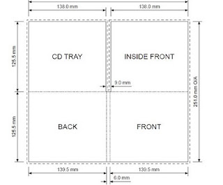
The most generic digipak design has a front cover, back cover, inside front and either one or two internal CD trays/ disk holders. The front cover tends to have an image that represents the artists genre of music or style and the back cover usually has a list of the music the public will find on the CD album. The digipak normally opens outwards and tends to have artistic designs or colours on all sides.

Here are some Digipaks from a range of different genres:

Justin Bieber (Pop)-

Rihanna (Contemporary R&B/Pop)-

Ellie Goulding (Indie Pop)-

Blink 182 (Rock)-


Tuesday, 16 January 2018

,


The representation of colour was a vital detail used in my music video, it separates the video into different sections. My music video opens with clips that have been sped-up, the speed distorts the images and reinforces the uncontrolled emotions of my character. The blue colour is not only a metaphorical link between the references to water in the lyrics and to the footage I filmed of the character in water, but it separates the opening section to the rest of the music video. A blue colour insinuates negativity and a lack of power. The cooled tone overlay gives the audience a quick insight to the mental health of the character.
The first shots that begin the non-linear story line of my video were edited and changed to appear in Black and White. The lack of colour implies the beginning of the morning, a clean and clear sheet where throughout the music video the mental health of the character is implied through strong references to loneliness and repetition. The colour builds up to full saturation, this occurs when the character washes their face. Water and cleansing is highly referenced throughout the music video, the build up of colour while the character looks into his own reflection, suggests that he is seeing himself properly for the first time. From this point the colour begins to fade, I over lay shots, one being less saturated and the other in Black and White, to suggest the fading memories and deterioration of the characters mental health. 


Sunday, 14 January 2018

,
This is a screenshot of the opening title I used in my music video. It introduces the title of the song and the artist. I wrote the title in a capital white front so that it could stand out from the background colours. I then outlined the text with a black colour so that the title of the song and the name of the artist isn't embedded into the background and is separated from both the light and dark colours of the background. The title of the song is centralised with the name of the artist positioned underneath, this presents this information clearly.  

Below are the credits that I positioned at the end of my music video. Influenced by the artist music video 'Dusk Till Dawn' by Zayn, I used a more flowery font for 'staring', 'featuring', 'directed by' and 'produced by' and a capitalised bold font for the name of the people involved in the music video. Similarly to Zayn's music video, these titles create a film-like appearance, which I believe reinforces a professional image. The first title gives credit to the main actor who plays the protagonist in my music video, in order, I list the second actor who writes the lyrics from the song (I portray him a the main character within my film). The last credit is to myself for directing and producing the music video. Within all of these titles I use the same font for the name of the persons that participated in the creation of my music video.


This is the final film title in my music video. I close the film with the name of the video and the image of my ident under the flowery font 'Produced by'. I use the same font for the title 'BRUISES' in this last title credit as the beginning, opening title. I made the font bolder and bigger to make it clear that it is the final title and credit on my music video. The white is a neutral colour that doesn't connote either a negative or positive attitude, it contrasts against the black making the font clearer to read.


Thursday, 11 January 2018

Tuesday, 9 January 2018

,

In the first published edit of my music video I worked on the positions of the clips and the order I wanted them to go in. I had recently filmed the second section found in my film and began to assemble the clips with the initial ideas I had over the editing and colouring of the clips.
I began to experiment with the meaning and narrative of the film by changing the speed and overlaying/ opacity of the clips.


In my second published edit of my film I worked on the transitions between the clips to make the changing clips flow smoother. I also adjusted the length of each of the clips so that they changed either on the beat of the music or when the music changed to smooth the transitions. I worked and developed my previous ideas by overlaying images and making the sequences work better. I also developed and fixed the colouring of my clips.


In the third published edit of my music video  I worked on fixing the second part of the film, shorting the overlaying section and slowing down, speeding up and reversing clips to manipulate the time within the film to express the repeated life the character has and his mental state breaking down. I also added an introduction to the music video, I chose poignant clips that show the development of his mental state and the story f the music video along with using clips that I hadn't featured in the video. I different shots such as close ups and pan shots to capture the movement of the character and their emotions. The introduction then ends of a clip of a closed door, a repeated motif and symbol used throughout my music video as the closer and separation he feels towards the world, the physical meaning becomes more relevant at the end of the film where the character walks out of the house closing the door ending the film with the same shot it started with.

Sunday, 7 January 2018

,
The image positioned below is the final design for my Ident. After the feedback I received from fellow students it was an equal vote between three out of four designs. I chose this one as my final Ident because although it is simple, it looks professional and the colour theme of black and white fits in well with colour themes I have used for my Ancillary One Digipak Design and my Ancillary Two Poster Design.
I used this design at the end of my film with the list of credits that name the people who featured in the music video. Because the background is black I inverted the colours so that the two main triangles are white and the smaller triangle going through the middle is black. The idea of the white triangle was to separate the triangles by creating a colour divide, when having a dark background I swapped over the colours so that the idea behind using the opposing colour to separate the two main triangles still applied.


Friday, 5 January 2018

,

First Student: My favourite one is the top one because I like the contrasting white and black, it's cool and stands out. The other three both have red in and the red is a bold colour and slightly distracts me from the actual design of the ident.

Second Student: I think the second one is the best because the red outline highlights the shapes. It's not too bold and doesn't blend in with the background. I think the bottom two look like warning signs because of the red background, overall I think the white background is better. 

Third Student: I prefer the bottom design because I like the colour, it stands out compared to the other three. I think the ones that are plainer don't stand out as much and are not quite as bold as the fourth one that has the red background.

Fourth Student: I think the bottom one is the best because I like how the red outlines it, more prominent and different. I like the top one but it's a bit too generic and I think the red and black colour surrounding the triangles separates up the design.

Fifth Student: I like the second design because of the red colour that surrounds the triangle. it stands out more to me compared to the other three. I prefer the white background and the red adds more depth to the Ident.

Sixth Student: I prefer the first design because to me it stands out more, the red is too bright and distracts me from the actual design. I like the plain black and white because it is subtle and simple.

Tuesday, 2 January 2018

,


In my film Ident designs I explore a range of different design ideas and abbreviations from the top one being my original design. My inspirations came from 'New Line Cinema' and 'Screen Gems'. NWL's design is black and white, similar to an over-exposed image or silhouette of a square with two lines of film next to and across the square. The contrasting black and white create a statement piece and stand out when the ident is used.
Similarly to this, SG's film identity is again a contrasting colour, red against black and the design is made up of shapes, rather than a picture or moving clip like Warner Brothers Ident or Walt Disney. Although the red makes it hard to read the ident, it makes SG's ident individual. In both of these idents the shapes are recognisable which is something I used to inspire me to structure the design of my own film ident.

The top design of the four was the original design I made and the other three designs develop from this one. The triangle shapes differentiate from one another, the two black triangles create a square, one of them is elongated which creates over hanging ends. I then edited a white triangle on the left angling it inwards, the white cuts up one of the triangles and crosses over the white divide between the two black triangles. Using black and white as the original colour theme was inspired by New Line Cinemas Ident. The two dramatic colours, although only connote both divide and connection, using the colour red, inspiration taken from Screen Gems' Ident colour theme, I wanted to first outline the white triangle to see whether making it visible from the background would begin to express another meaning to the design. Using the red to outline the triangle made it the focal point within the ident making it the first thing looked at from the viewer. I then developed this idea and changed the background of the ident, creating a borderline of red. I also outlined the triangle in black to separate it from the two black triangles.
Similarly to BBC 3's logo, there is a coloured borderline around the original logo. Whether the background is part of the design (For the BBC Ident 'II!') or was added so when placed on a darker background it does't blend in or adopt an automatic white or black background, the colour becomes associated with the film ident, which as a potential idea for my own, red seemed suitable and as a development from my original design shows the process of my thoughts.

The last design is similar to the third but I too out the black outline from around the white triangle. Minimising the outline enabled me to make the white triangle bigger and enabled it to become the focal point within the ident, stopping the red background overpowering the design of the ident.