Wednesday, 28 February 2018

,
The first advert analysis I did was Jay-Z's magazine advert for his album 'The Blueprint 3'.


Background Information

During a rough adolescence, a topic that is addressed quite frequently in his autobiographical songs, Jay-Z, Shawn Carters' stage name, expresses how he dealt with drugs and gun violence. Jay-Z later recalled in one of his songs ('December 4th'): 'I went to school, got good grades, could behave when I wanted/ But I had demons deep inside that would raise when confronted.'

At a young age Carter turned to raping to escape from the drugs and poverty that surrounded him and in 1989 he began working with the rapper Jaz-O to record a song called 'The Originators' which later won both the rappers an appearance on an episode of Yo! MTV Raps.
In 1996 Carter released his first album 'Reasonable Doubt' that reached No. 23 on the Billboard 200, and in 1998 he released his second album 'Vol. 2... Hard Knock Life' the title track later famously became featured in the Broadway musical Annie and then nominated for a Grammy. 

In 2003 Jay-Z retired from raping but began to creating music again three years later. In 2009 'Blueprint 3' was released along side two others, the trio of albums released marked a significant time in the development of Jay-Z's sound and music from rap to more R&B/ soulful.
During his break from rapping, Jay-Z moved his attention to the business side of music, signing a $150 million contract with the company Live Nation that then grew in size to be later renamed Roc Nation, a company that handles artists careers. Jay-Z became the president of Def Jam, Jay-Z and later signed artists such as Rihanna, Ne-Yo and Kanye West through the company to develop and transition their artistic talents.

Main Image 


The main image consists of a white background and a pile of white painted musical instruments and speakers. The contrast between white and black creates a separation from the body of the instruments to the black keys and buttons stand out. Across this image are three red lines that both signifies the release of Jay-Z's trio of albums and a more mathematical definition when two formula's are logically equivalent when all models give them the same value.


Title


On this magazine advert there are two titles, the name of the artist and the name of the Album. The name 'Jay-Z' is written in a bold and wide blank font, it is centralised on the poster, above the three red lines which helps it to stand out. The actual font itself dominates and is one of the first things that the receiving audience will look at. The simplicity of the poster enables the primary focus to fall on the name of the artist and the red three lines in the middle of the poster.                                                                                                              
The font used for the album name is different to the one used for the artists name, it is smaller than the name title which connotes that Jay-Z may have been selling the album with his name as a primary selling rather than the title of the album. This shows that Jay-Z's name is more recognisable and that he wanted the title of the album to be the selling point for the album.

Layout
The edited overlaid three lines are centralised on the background of the poster, covering the background design of white painted musical instruments piled on top of one another. The title of the album and the artists name is edited and placed above the background of instruments and the information involving the album release and credits are placed at the bottom of the poster with equal spacing between the three sections of information.

Font
We have three different types of font on this advert. First is the name of the artist, written in bold, black cursive, it seems to have been stretched in an irregular font and stands out dramatically. The second style of font is the title of the album, the size is smaller than the title of the artist and is printed in black, capital narrow font. The information telling the audience the release of the album also uses the same font as the one used for the title of the album. The third font is used to print the artists website. It is written in capitals and published in a smaller font than the size used to tell the audience about the release of the album. This shows that this piece of information is more of a minor heading.

Colour Scheme
The colour scheme consists of both bright and dark colours, the background includes the white, grey and lighter purple colours in the colour scheme. The font that is edited and overlaid across the background uses black and the triple bar across the centre of the poster is in bright red, though only slightly transparent the colour is darker in some places due to the background instruments.


Sunday, 25 February 2018

,

In this screen shot I created a diagram that shows my thoughts and planning for my Magazine Cover/Poster. I used the themes as ideas to branch off into what designs I could possibly use to create for my poster. By studying the song I have chosen to underlay on my film, 'Bruises' by Lewis Capaldi, I portrayed the meanings behind the lyrics through my filming and story line and now I have also used it to inspire my magazine cover so that I can create a running similarity through my work.

Friday, 23 February 2018

,

What is an Album Magazine Advert?

Magazine Album Adverts are advertisements that are published in magazines to promote an artists most recent album release. The advert will also enable the public or the bands chosen target audiences to know the song releases 

Magazine adverts are advertisements in magazines that promote the artists and the release of a new album. They let the target audience know of new music by artists as well as the release date of the music and possible features the album will contain along with giving information on how to purchase the album.
The general, widely used template for an album magazine advert looks like this:
The advert follows a style, layout and design similar to the actual album. Artists do this to create a more branded appearance for the album, or use an overarching colour design (such as The Weekend) or font (found in Bruno Mars' work) to apply to the design. An Album Magazine Advert is popularly found as a single page spread, though double-page spreads are not uncommon and feature information on the album cover, artists name, album title, a ( or multiple) magazine reviews, the release date and any other information to the artists or bands social media or ways to contact the institution. 

Here is a range of different album magazine covers that show a range of different artists work:

'Club Paradise Tour' by Drake-

'Wake Me Up When September Ends' by GREENDAY-

'Who You Are' by Jessie J-

'RATED R' by Rihanna-
 'Strange House' by The Horrors-


Wednesday, 21 February 2018

,
Student One: 

I prefer the middle one because it’s a crisp and clear design, the top one is drowned out because of the white background and I think that the bold outline of just one hand draws the attention to the one hand and would distract from the message made by the two fingers reaching out.

Student Two:
Given a bold title I think the middle design being more subtle is better. Although I like the design with the white background because it would stand out more, changing the title font to black would also make it appear more dramatic and eye catching.

Student Three:
I preferred the bottom picture because the black background makes it look professional. Having a bold hand will make the design look less bland and make the design stand out more.

Student Four:
I prefer the middle design because it’s subtle and the black makes the white stand out because of the high contrast. It looks artistic whereas the bold version is too much. The one with the white background looked too simple, this makes the image look like a drawing rather than an artistic design.


Tuesday, 20 February 2018

,
This is my final design for the inside right section to my Digipak. I used the same font and layout from the title used for the CD design as the front cover. I chose to do this so that if the CD is ever separated from the CD cover the audience can see the similarities between the two. I also included the same design used for the inside left section of my Digipak Design. Having the designs from the left and the inspired designs taken from that section used on the CD gives the impression of the shapes moving cross the album (from the right to the left inside designs).

I chose to include a thick white line around the edge of the CD to separate the swirling design and text from the edge of the CD. This design is also popularly used within other artists CD designs, a single white line becoming popular within fashion and in the media. The border also gives the slight effect of a record player, a design more old fashioned, the line also appeals to a wider audience because it of the neutral colour.

Saturday, 17 February 2018

,
This is an image of the inside left design to my Digipak. I created the swirls on 'Illustrator' and copy and pasted them across to 'Photoshop' where I enlarged and twisted them around into different positions. The metaphorical shapes of swirls represent a continuous movement, reflecting the style of the music and the messages made within each of the songs. The hand drawn images carry an aesthetic and receive a positive appreciation from the audience. I centralised the swirl designs and embedded them into the background of the inside left design from the album. 

I chose to include lines from the chorus sections from each of the songs found on the album. This creates a personal touch to the album and ties the design of the album in with the songs found on the album. Once the audience becomes familiar to the lyrics, the words chosen will become meaningful and represent the emotions the artist expresses within each of his singles.
Although the front cover design is simple and the back cover design is minimalistic, this design brings the two outside designs together, linking the CD to the rest of the album by creating a depth due to the more intricate and bolder design.

Thursday, 15 February 2018

,
This is my final design for my Back Cover. I used the same colour scheme as the one on the front cover to follow a theme that will create the entire album. The white outline of the fingerprint is merged into the background colour, this enabled me to foreground the list of songs that will feature on the album with a brighter white coloured text.


I centralised the text in the middle of the back cover design and and purposely moved the fingerprint drawing off centre. I chose to move the drawing because I believe that if it was centralised with the text overlaid on top then the audience would be distracted from design. Not having the two aligned separates the text from the image. The type of text used to list the title of the songs is written in a simple, easy to read text. The non-fancy font lacks connotations, this means that this design becomes less dominant over the front cover design.


Tuesday, 13 February 2018

,
After receiving two different types of audience feedback, one relating to the colour of this design and the other to the thickness of the lines of the hands, I created this design to be my final front cover. This title consists of a an off-black and white theme, the simplistic colours enables the design of the hand and the text to appear clean and easily distinguishable. The drawing of the hands is meaningful and by placing them in the central line they are the first detail that the audience looks at. The boldness of the artist name contrasts with the intricate drawing of the hands, I made this decision so that both of the titles and the design don't distract from one another.
 

After studying the from covers of a variety of artists and bands I saw a distinct similarity between the ones I analysed. The artist and bands had enlarged then name of their band or stage name, across the front of the album. this shows that the artists name is a bigger selling point than the name of their albums. I decided to use this researched knowledge and applied it to the design of my front cover. The name of the artist and title of the album is slightly off centre, because the name of the artist is in bold lettering, moving it off centre means that it doesn't overpower the front cover.

Thursday, 8 February 2018

,
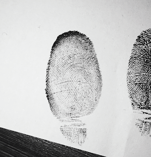
I took a multitude of photographs so that I could get the clearest one to draw an outline around. The one I chose to use was taken with a flash, this enabled me to capture a clear focus around the finger print. I used red face make-up paint to coat my finger so that I could leave a clear fingerprint mark on a piece of paper, it took many tries to get the perfect finger print because the paint was either too wet or too dry which effect the clarity of the finger print.

Using the editing platform 'Illustrator', I imported the image and used the 'curvature' tool to follow the outlines of the fingerprint. Originally I traced around the outside of the finger print so that when the entire drawing was finished I had a drawing replica of the entire finger print. Inside I decided to just trace the lines across the finger, this way there would be no definite line for where the lines finish, but where I stopped tracing in itself created an edge for my drawing. I outlined in red so that I could see the lines I was drawing easier, later I will convert them to white as I will be overlaying this image on top of a black background.

This is what the final imaged ended up looking like. I will overlay this on top of another black background so that I can enlarge it and tilt it slightly so that this design can fit along the the aesthetic of my album. I really like how there is no edge to this drawing; where the lines stop creates an indirect outline of the finger print. Some of the lines and details of this finger print is missing, this creates a drawing with more depth and texture to it, where as a finished drawing would have looked flat.

Tuesday, 6 February 2018

,
 For my Digipak front over design I was unsure of how I should style my hand drawing. I used SurveyMonkey.com to help me find out what type of line I should use for my outline drawing.


I asked the question 'Which album art do you prefer?' and left a link to my Pintrest page where the images could be found.

The image on the left shows the original design of my drawing. I used the line thickness '2' to capture a thin outline drawing of the hand. The image in the middle has an overlaid and enlarged version of the original image on top of the original image. The double hand effect creates a 3D like appearance and adds more depth to the image. The image on the far right is the same drawing as the original image but I thickened the outline, this made a more dramatic and cartoon like effect.


I attached the link onto my social media sites and sent messages to my friends asking them to follow the link and rate which design out of the three they preferred.


This is the ranking for each design:
1. Single Line Outline (4 Votes)
2. Double Hand Effect (1 Vote)
3. Thick Outline Design (0 Votes)

The overall feedback listed that the Single Line Outline was the best size, after receiving this information I carried on with the original design.


Sunday, 4 February 2018

,
I took many photographs, with and without a flash to capture the most detailed picture that also demonstrated a range of compositions and tones that I could work with. The image I chose shows two hands, one reaching upwards and the other reaching downwards. Inspired by Michelangelo's painting 'The Creation of Adam', and the representation hands portray within metaphorical terms, I posed two hands with a flash light against a plane background so that I could capture the clearest outline to draw from.


I used the drawing program 'Illustrator' to enable me to draw an outline from the drawing. I used the 'curvature' tool where I dragged and shaped a sculpting line around the edge of the drawing. I had to change the settings of this tool so that when I was creating the outline the lines would not infill. I changed the shaping tool to a white colour so that it would stand out against the picture. Using the ability to hide layers, I was able to remove the image of the hands from my drawing to see the development of it. I had never used this program before, so by exploring a new platform I was able to expand on my ability to edit and to apply this to grow my artistic talent.  

Once I finished editing I changed the colour of the outline to black so that when I got rid of the image behind it I was left with my outline drawing. I used the outline thickness '2' throughout the digital outline so that it would create a this even outline throughout the drawing. I chose to create a design like this for the front cover of my digipak because it holds a simplistic beauty that creates a personal touch to the design of the album and an overall athletically pleasing design. 


Friday, 2 February 2018

,
Throughout my entire music video the emotional representation of hands is repeatedly used. This re-occurring motif expresses the struggling mental health issues my character is fighting. The symbolism of hands are expressed through entire works of literature and drama. They enable us to touch, feel and experience items around us and are part of an essential to express our emotions both positively and negatively. The narrative of my music video capture my character washing his hands and face in water, the representation of cleaning and hands link together through the physical ability to feel the movement of the water and then to disperse it across the body.   
The representation of hands are a stigma for my character as they enable him to portray his emotions and slow inclination of mental health. From on going research, the use of touch enables people to calm down from panic attacks, fidgeting and enables a person to receive a general acknowledgement of comfort.

I wanted to represent the emotional connection that is created through the use of touch. Inspired by Michelangelo's famous piece 'The Creation of Adam' I wanted to re-create a similar hand position. Although the music for my video doesn't have any religious connotations, the hand reaching position between Adam and God is a powerful one. The depiction became iconic for humanity, showing the power of life through the touch of a finger. Using the metaphor within this image, I wanted to represent the power and influence made by this hand position to also represent the type of music found on the album.